
Natasha Mason
“Creating a brand that feels like a remembrance of who you are.”
The Brief
When Natasha first came to me, she wasn’t simply looking for a logo—she was searching for a visual identity that could evolve alongside her growing business.
Her work beautifully blends yoga, somatic movement, dance, facilitation and music, with a vision to expand into workshops, retreats and practitioner training. She wanted a brand that felt elegant, mysterious and deeply meaningful—something that reflected not only what she does, but who she is.
Rather than choosing a business name, Natasha wanted to build her personal brand, allowing room for her business to grow and evolve naturally.
The Challenge
The challenge wasn’t creating a beautiful logo, it was translating a deeply personal story into a timeless visual identity.
Natasha shared several meaningful elements that she hoped to incorporate, including:
– The Leo archetype and the lion
– Regulus, the heart star of Leo
– The sacred rose
– The red thread
– Themes of the priestess path
– Rich jewel tones and gold
– A luxurious, symbolic aesthetic
Each element held personal significance, but the design needed to feel cohesive rather than overly complex.
My Approach
Every project begins with connection.
Using a combination of thoughtful discovery questions, open discussion and intuitive guidance, I take the time to understand not only what your business does, but the story, purpose and energy behind it.
I believe the strongest brands are created when strategy and intuition work together. By blending practical planning with creative insight, we uncover a visual identity that feels authentic, meaningful and truly aligned with who you are and the direction your business is growing.
Every colour, symbol and design choice is intentional—creating a brand that doesn’t just look beautiful, but genuinely feels like home.
The Outcome
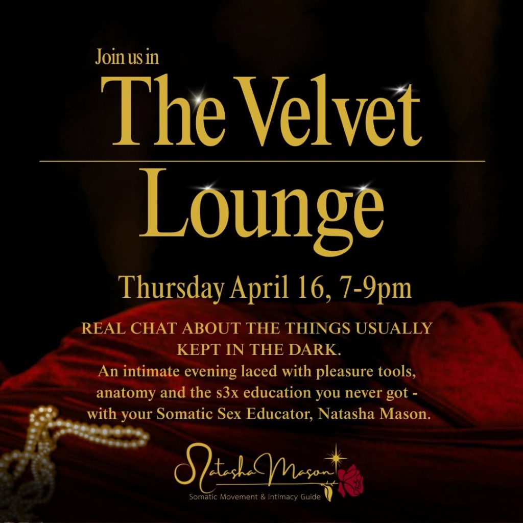
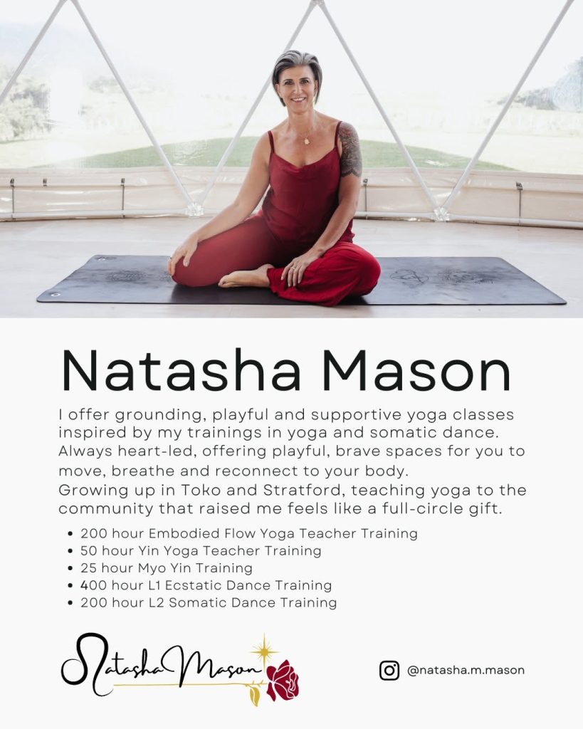
The final logo became far more than a business mark.
It became a visual representation of Natasha’s journey, her values and the work she is here to share with the world.
Every detail carries meaning—from the Leo symbolism and Regulus star to the rose, representing beauty, devotion and the sacred feminine.
The finished brand provides a strong foundation that Natasha can confidently build upon as her business continues to evolve.


Client Reflection
One of the most rewarding parts of this project was seeing Natasha’s response to her completed brand identity. For Natasha, this was never just about creating a logo—it was about capturing the essence of who she is and the work she is here to share. Every element was thoughtfully designed to reflect her story, values and the symbolism that holds deep personal meaning.
When she unveiled her new brand, she described it as:
“A reflection of my inner world.”
She shared how the design embodied heart-led leadership, the sacred feminine, courage and personal transformation, describing it as “a living symbol of my essence, my lineage, and my becoming.”
Perhaps the most meaningful words she shared were:
“This logo feels like a remembrance of who I am, and a blessing for everything I am stepping into.”
For me, that’s what meaningful branding is all about—creating an identity that feels authentic, aligned and gives you the confidence to step into your next chapter.